LCM LANDSCAPING SERVICES

SCOPE
Brand Identity Systems, Fleet Graphics, and Digital Presence Strategy.
THE PROBLEM
LCM required a visual evolution that communicated both professional scale and local reliability. The existing identity lacked the "visual weight" necessary to stand out on busy roads or professional job sites. The challenge was to create a mark that felt "solid" and "engineered" while maintaining the approachable nature of a community-focused firm.
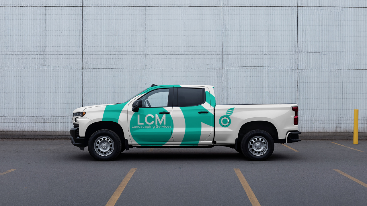

THE STRATEGY
Utilizing high-contrast geometry and "High-Viz" color palettes. The strategy centered on the "LCM" monogram, designed with structural weights to imply strength. By pairing a vibrant "Safety Teal" with deep charcoal tones, we ensured the brand would remain legible at high speeds on vehicle wraps and sharp on mobile screens.
FULL BRANDING GUIDELINES
View the comprehensive identity standards for LCM Landscaping.
VIEW DESKTOP GUIDE (PDF) VIEW MOBILE GUIDE (PDF)THE RESULT
A bold, cohesive identity that commands professional authority. The redesign provided LCM with a "commercial-grade" aesthetic that separated them from independent contractors, establishing the firm as a market leader in premium property transformation.